Canvas by Instructure
How might I redesign the interface to be responsive and user friendly?
This was a 2 month-long course project where we rearchitected the Canvas Student interface. Students were to design an entirely new dashboard in order to create a consistent, responsive experience.
Scenario
We began with a design experiment, in this scenario students were to redesign the Canvas Student Dashboard. Students were told that Instructure did not know exactly what they want, but said that they wanted it to be clean, and simple. Instructure's team also wanted it to be functional and helpful to students. Though they would consider additional or new features and functionality to improve the user experience, however they did not want to get rid of any of the existing functionality of the dashboard.
_Page_2.png)
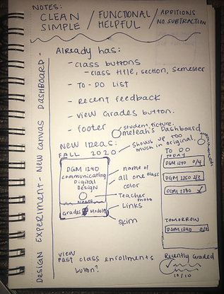
Initial Exploration
I began by exploring the existing site.
I wanted to experience the existing dashboard just as it is in order to start my redesign process. I noted important features Canvas currently had. I then began to note ideas that would improve the dashboard and its functionality, and luckily as a student who uses Canvas frequently for my university, I included some features I knew I would find helpful.
_Page_1.png)
Back to the Drawing Board
After our initial exploration and after seeing the work of our peers it was time to go back to the drawing board entirely to explore even more new improvements. I wanted to create as many wireframes as I could, exploring multiple different solutions to the experimental redesign. A big part of my wireframe process was improving the functionality, matching the dashboard to the mental model, or how a person would expect this product to work compared to other real word products they have used before. Since many current college students understand typical smart phone applications and I wanted to try and replicate Apple's interface.


Moving to Digital Design Tools
After some more exploration wireframes it was time to decide which designs I was going to take moving forward with grey compositions. It's important to pick a design that not only meets the design requirements, but solves the initial problems that needed to be solved. I chose to continue on with the wireframes I thought would be the most natural to use when the product was finished. I really liked my initial design and it played a big part in how my final design looked. I began to create these grey compositions with the end in sight.


Creating Surface Compistions
I rounded out the grey compositions by turning them into surface compositions with color and a few adjustments. I wanted the color to be quite minimalistic but used intentionally. If I were to create another iteration of this design in the future, I would like to adjust the text to a variety of scenarios and even adjust the main dark green color I used as my university color and see what it would be like to use other colors. Another improvement I want to make is to be more aware of how color is used to reference each course and to not let it interfere with any other color being used in the interface. After doing that I would want to make my surface compositions into a clickable prototype to test its navigation. I also think my text hierarchy is fine but I do need make some of the text larger. But overall the dashboard and supporting pages were improved to be clean, simple, and functional.


