Cotopaxi's Questival App
How can I redesign an existing app to simplify and enhance the user's experience?
In this mobile app redesign my goal was to simplify the user's experience. With an app with only 1 star ratings, this app needs more than just fresh-looking UI. We needed to uncover the problems user's had been facing and why they were not pleased with the app. The way I approached this design helped me to learn how to back up my design decisions, gather user input, and to discover the underlying problems of a poor user experience.
Choosing a Product Catalog
This design challenge was to redesign a product catalog, however a product catalog could be anything that stored lists of items with different features that users can interact with. I decided to redesign an application that already existed, something that could feel like a real project I may take on in the future. I looked around at apps that currently existed and felt uninspired. I wanted something fun and exciting, something I could commit to because I cared for the end product. I currently am in love with Cotopaxi's products and their mission to create sustainably designed outdoor gear that fuels both adventure and global change. However when I looked in the app store at the reviews for their app, I noticed something peculiar. Unhappy adventurers. Cotopaxi currently does not have a mobile shopping app but they do hold these adventure scavenger hunts every year, a great marketing opportunity but even more so, a great user experience. So why didn't the reviews match?


The Problem
These user reviews state a lot of problems, especially on the functionality side. However I believe that people focus a lot on the problems of an app being difficult to use especially when the design of the app isn't what it should be. I figure if people are faced with a design they enjoy they become more patient for technical problems. The solution? Better app structure and match between system and real world. I decided to attack this problem by just redesigning and restructuring what was already available. Which means for the first time ever, I skipped my sketching phase.


Doubts and Designs
I still was so excited about this project. I decided to do some research on Questival to see what it was all about. I came across a page where a marketing company had already produced a redesign for Cotopaxi's Questival. However, it hadn't been implemented? I questioned why when the design created by the marketing company seemed great but it completely mowed over Cotopaxi's original design for their app. Even though I had questions between the two designs I decided to continue on with just updating the look of what was already there, it felt more Cotopaxi in the colors and simplicity of the design.


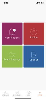
Overall Improvements
-
Use more color.
-
Improve navigation, update iconography.
-
Tinder-like voting process with search and filter functions.
-
Add Floating Action Button within challenges to save challenges for later.
-
Add a map search feature.
Key Takeaways
My key takeaway from this project was that I really wanted to design for the user. I wanted to design around their needs and pain points they've expressed in their reviews of the product. It helped me to see how important it is to consider the user in the design process because at the end of the day, if they aren't happy they won't use the app. It's quite a domino effect from there, they won't use the app, they won't want to participate in the event, marketing opportunities are lost and all of a sudden a company is experiencing higher churn rates. With an outstanding experience like Questival, the mobile experience and how it's required to participate in the event needs to match.